
A few years ago, redesigning a website felt like one of those things you had to “properly prepare” for.
You know the kind of preparation I mean.
- Find a developer.
- Explain the vision.
- Pay a decent amount of money (usually thousands of dollars).
- Wait.
- Review.
- Wait again.
- Ask for changes.
- Wait some more.
The entire process used to take over 3 months before you can even launch. That’s time a fast-paced business doesn’t have these days.
And to be clear, I am not saying web developers are no longer important. Please, don’t misquote me.
A proper website still needs thought, structure, strategy, design sense, and technical understanding. But the way we get from idea to execution has changed so much that it almost feels unfair.
Because just yesterday, I redesigned my entire website in about two hours using ChatGPT, Elementor, and Ctrl + Shift + D.
Yes. Ctrl + Shift + D.
Not some secret developer tool. Not a hidden website builder hack. Just the ChatGPT dictation shortcut that let me speak my instructions instead of typing every single thing.
And honestly, that shortcut carried.
Here is the backstory.
I bought my domain in December 2025. At the time, I knew I wanted a website, but I did not have the full picture yet. So in January, I quickly put something together.
And when I say quickly, I mean QUICKLY.
The first version was plain. Bland. Functional in the way a plastic chair is functional. It existed, yes, but it was not exactly the kind of website I wanted to proudly send to someone and say, “This is what I do.”
But I let it sit there for months.
Every now and then, I would open it, stare at it, mentally promise to fix it, then close the tab and go back to whatever else was demanding my attention.
Until yesterday evening, I finally had a little time.
Okay, just for context, yesterday was actually the 22nd of May, 2026.
I turned on the TV, started watching Swapped, and somewhere between the movie playing in the background and me side-eyeing my own website, I decided it was time.
I thought maybe my website design also deserved a swap.
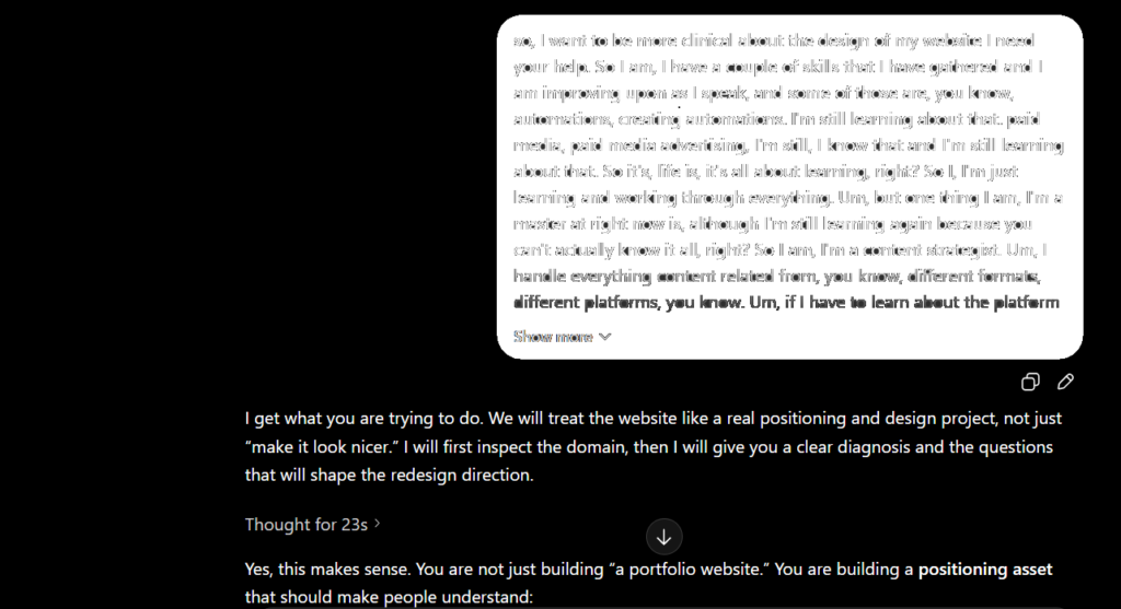
So I opened ChatGPT and started talking.
Not typing long, perfect prompts. Talking.
I used Ctrl + Shift + D, dictated what I wanted, corrected what felt off, asked for better versions, rejected designs that looked too generic, and kept pushing until the website started looking like something I could actually stand behind.
Two hours later, the old website was gone.
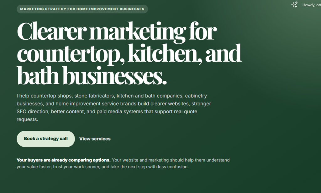
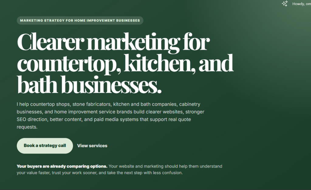
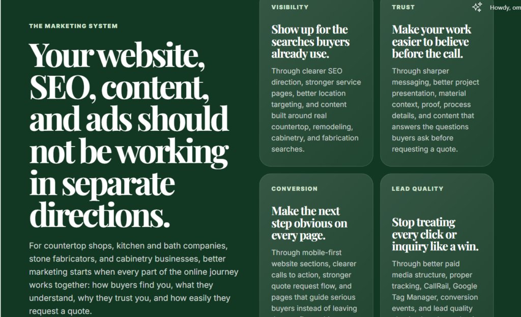
In its place was a cleaner, sharper, mobile-first website built around the exact kind of businesses I wanted to serve: countertop shops, kitchen and bath companies, stone fabricators, cabinetry businesses, and other home improvement service brands.
This post is the full story of how that happened. What I changed, what ChatGPT helped me do, what I still had to do manually, and what this little experiment taught me about AI, websites, and the power of knowing what you want before asking a tool to help you build it.
The Website Already Existed, But Let Us Be Honest
The website was not new.
I bought the domain in December 2025, and by January, I had already thrown something together because I wanted to start testing website design properly.
And honestly, that first version did what first versions usually do.
It existed.
It was not terrible. It was not broken. It was not embarrassing enough to delete immediately.
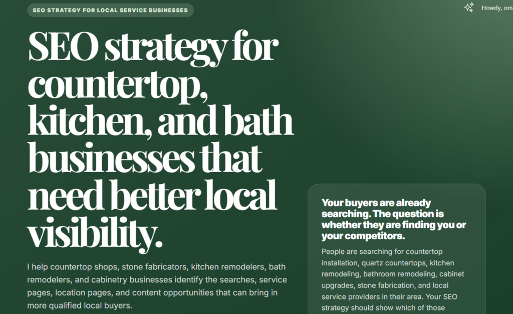
But it was plain, bland, and too general. It did not feel like the kind of website I wanted to keep sending people to. It also did not clearly reflect the direction I was moving into: helping countertop shops, kitchen and bath companies, stone fabricators, cabinetry businesses, and home improvement service brands build a stronger online presence.
So for months, I kept telling myself, “I will fix it.”
Then I kept not fixing it.
The Problem Was Not Just That It Looked Basic
At first, I thought the issue was the design.
Maybe the colors were too plain. Maybe the layout needed more life. Maybe more images. Maybe the pages just needed to look more “professional.”
But the more I looked at it, the more I realized the real problem was not only visual.
The website was too broad.
It did not feel “designed” and did not speak clearly to the kind of businesses I wanted to work with. It was not sharp enough for countertop shops, kitchen and bath companies, stone fabricators, cabinetry businesses, or other service brands.
And that matters because a website can look decent and still fail quietly.
- If the copy is vague, people will not immediately understand what you do.
- If the pages are too general, the right buyers will not feel like you are speaking to them.
- If the service offer is not clear, the website becomes just another nice-looking page on the internet.
That was the real issue.
The site did not just need a better design.
It needed a clearer direction.
So I Asked ChatGPT How To Fix It
At this point, I knew I wanted to redesign the website.
What I did not want to do was open Elementor and start dragging things around with no direction.
That is how you end up spending three hours adjusting one button, only to realize the entire page still looks confused.
So I started with ChatGPT.
I asked it how I could approach the redesign properly, and one of the first useful things it did was point me toward Land-book for website inspiration.
That was the moment things started making more sense.
I went through different website examples, looked at layouts, spacing, section styles, typography, color usage, and how modern service websites were structured. I was not trying to copy a website exactly. I just needed a visual direction strong enough to stop me from guessing.
Once I found the kind of design style I liked, I brought that direction back into ChatGPT.
Then the real work started.
I gave it context about the kind of businesses I wanted the website to speak to. I explained that the copy had to be specific to countertop shops, kitchen and bath companies, stone fabricators, cabinetry businesses, and home improvement service brands (yes, even the copy was done completely by ChatGPT with my direction).
I also made the rules clear.
- No childish design
- No random emojis and icons
- No vague marketing language
- No fluff
- No desktop-first layout that becomes stressful on mobile.
The goal was not just to make the website look nice.
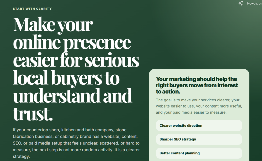
The goal was to make it look intentional, mobile-first, and super-lightweight.
The First Real Fix Was Positioning
The first thing I changed was not the design. It was the direction.

Because when your website is trying to speak to everybody, it usually ends up sounding like it is speaking to nobody in particular.
That was the problem with the old version. It was too broad. It sounded like a regular service website for “business owners,” which is fine until you realize every other service website is also talking to “business owners.”
I did not want that.
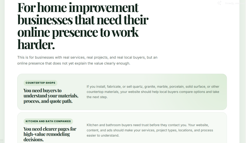
I wanted the website to speak directly to the kinds of businesses I actually wanted to work with: countertop shops, kitchen and bath companies, stone fabricators, cabinetry businesses, and home improvement service brands.
Once that became clear, everything else started changing.
- The copy became sharper.
- The service pages became easier to structure.
- The problems became more specific.
- The design choices started making more sense.
Instead of saying vague things like “grow your online presence,” the website could now talk about real problems:
“weak quote request flows, poor mobile experience, vague service pages, thin material pages, wasted ad spend, bad tracking, unclear SEO direction, and websites that look decent but do not help serious buyers take the next step.”
That was the real turning point.
The site did not become better because I changed the color palette. It became better because it finally knew who it was talking to.
Then We Started Building Page By Page
This is where things became serious.
And by serious, I do not mean I suddenly became a full-stack developer in the middle of watching Swapped.
I mean I opened Elementor, added an HTML widget, and started building the website one section at a time.
That was the workflow.
ChatGPT would create the section.
I would paste it into Elementor.
I would preview it.
Then I would come back and refine anything that felt off.
And trust me, there was a lot of refining. But the good part is that it was quick.
- If the section looked too generic, I said so.
- If the design looked too similar to the previous one, I said so.
- If the copy sounded too broad, I corrected it.
- If the layout did not feel mobile-first, I pushed back.
We built the site in pieces:
- hero sections
- problem sections
- what is included sections
- process sections
- CTA sections
- service pages
- footer sections
The interesting thing is that the website did not come out of one perfect prompt.
It came out of small corrections.
A section would start as an idea, then become code, then become something I could see on the page. From there, I could tell what worked, what felt lazy, what needed more space, what needed sharper copy, and what needed to be redesigned completely.
That process made the whole thing feel less like “AI built my website” and more like “AI helped me move faster while I directed the work.”
Which, honestly, is the better way to use it.
The Design Rules That Saved The Website From Looking Childish
One thing I’ve learned in my years of creating with AI?
If you give AI too much freedom with design, it may start acting like a children’s birthday flyer committee.
- Suddenly, everything wants to have an icon.
- Every section wants to be “fun.”
- Every block wants to do too much.
And before you know it, your serious business website is one sparkle away from looking unserious.
So I had rules.
- No emojis.
- No random icons.
- No childish visual elements pretending to be personality.
The website needed to feel mature, clean, and intentional. The primary color direction was deep green, supported by softer green shades. The sections needed to have enough breathing room. The cards could not feel cramped. The buttons had to be easy to tap. The copy had to be readable on mobile without making someone pinch their screen like they were trying to inspect an ancient document.
Mobile-first was non-negotiable.
If a section looked nice on desktop but felt stressful on a phone, it did not pass.
I also had to keep watching the layout rhythm. Some sections started looking too similar to the ones before them, and that made the page feel less intentional. So I kept pushing for variation: dark sections, light sections, editorial rows, cards, split layouts, shorter CTA blocks, and cleaner section breaks.
That was one of the biggest lessons from the whole process.
AI can move fast, but fast is not the same thing as polished.
- You still need taste.
- You still need rules.
- You still need to know when something looks good and when it just looks busy.
The Website Became Lightweight On Purpose
Another thing I liked about the redesign was how light it became.
The site does not depend heavily on images, which means the pages can load faster and feel cleaner. No heavy galleries forced into every section. No oversized visuals slowing things down. Just clear copy, strong layout, and enough design structure to make the pages feel polished.
But that does not mean the site is anti-image.
Images can still be added later, especially project photos or brand visuals. The difference is that they would be placed intentionally, not randomly. For example, some of the green sections can hold subtle image layers underneath the design, so the images support the look without taking over the page.
That also creates room for image SEO without making the website feel heavy or cluttered.
The goal was simple: make the site clean, fast, flexible, and easy to use.
The Few Things AI Could Not Magically Finish For Me
Now, to be fair, ChatGPT did not do everything.
It helped me build the structure, sections, copy, and code much faster, but some things still had to be done manually inside WordPress and Elementor.
For example, I still had to set up the blog page properly so new posts could automatically appear there. I had to check the menu, test the buttons, confirm the links, review the mobile spacing, adjust a few Elementor settings, and add page titles and meta descriptions.
Basically, the visible website came together fast.
But the final setup still needed human eyes.
And I think that is the honest part people miss when they talk about building with AI.
AI can help you move quickly, but you still have to publish carefully, test properly, and make sure the website actually works the way people will use it.
What ChatGPT Did Well And What I Had To Keep Correcting
ChatGPT was very good at speed.
It helped me think through the structure, write page sections, generate Elementor-ready HTML, refine service page copy, and move from one idea to a live section quickly.
But it was not perfect.
- Sometimes the copy became too broad.
- Sometimes the layout started looking too similar to the section before it.
- Sometimes the sections became longer than they needed to be.
- Sometimes I had to remind it that the whole website had to be mobile-first.
- And yes, at one point, I had to remind it that I was using the Elementor HTML widget, so the CSS and HTML needed to come together in one complete block.
That is the part people sometimes skip when talking about AI.
You still have to direct it.
You still have to know when something is too vague, too busy, too generic, or just not aligned with the original vision.
So no, ChatGPT did not magically redesign the website while I sat there doing nothing.
It was the assistant. I was the creative director.
Final Thoughts
Would I recommend redesigning your entire website while watching an animated movie on a random evening?
Honestly, maybe.
But only if you are ready to give the AI clear direction. Because ChatGPT can help you move fast, but it will not automatically know your taste, your audience, your offer, or the kind of website you want to be proud of.
That part still needs you.
My website changed because I stopped trying to make it “look better” and started asking better questions.
- Who is this for?
- What problem does each page solve?
- What should a serious buyer understand before they contact me?
- What should this section make them feel or do?
That is what turned the redesign from a quick experiment into something useful.
So yes, I redesigned my website in about two hours using ChatGPT, Elementor, and Ctrl + Shift + D.
But the real tool was not just AI. It was direction.
Pingback: The 6-Step AI Coding Workflow That Saves My Codex And Claude Code Limits - 95greenshark.com